Ask a salon for an ivory dress and you may be shown three dresses in three visibly different colours, all called ivory. Ask for white and one of them will be the same as the ivory next door. Ivory is a warm white with a hint of cream, while bridal white runs from a blue-toned stark white to a faintly warm natural white. Colour in bridal has names but no standard, and the names are the least reliable part of the whole process.
This guide sets out what the names usually mean, why they drift between makers, how skin, fabric and light change a colour, and how to compare swatches so the decision is made with your eyes rather than a label.
The shades, from coolest to warmest
From coolest to warmest, the bridal shades are stark white, natural (or diamond) white, ivory, champagne and blush.
Stark white (also optic or pure white). A blue-toned white with no yellow in it, the colour of printer paper. Only synthetic fibres reach it; silk cannot be bleached that far without damage. It is the least common choice and the most unforgiving: it reflects a great deal of light and photographs as a flat block.
Natural white (also diamond white, silk white, soft white). The palest white that a natural fibre can be. It has a trace of warmth that the eye reads as white rather than cream. Next to stark white it looks faintly warm; on its own it looks white. It is the usual "white" in silk dresses.
Ivory. A white with a clear warmth, from a hint of cream to something close to a very pale beige. This is where the names fall apart, because one maker's ivory is another's natural white and a third's light champagne. Ivory is by far the most common bridal colour, and for most skin tones the safer starting point.
Champagne. A pale gold or warm beige, sometimes with a pink or grey cast. Definitely not white. It suits warm skin, looks rich in satin, and reads as vintage in lace. Some dresses combine a champagne lining with an ivory lace over it, which is a way of warming the colour without committing to it.
Blush. A very pale pink, from barely there to clearly rosy. As with champagne, it is often achieved with a coloured lining under an ivory or white outer layer, so the pink glows through rather than sits on the surface. It flatters cool and neutral undertones better than champagne does, and it photographs warmer than it looks.
| Name | Undertone | Fibres it is usually found in | Reads in daylight as |
|---|---|---|---|
| Stark white | Cool, blue | Polyester, some mikado | Bright, flat white |
| Natural or diamond white | Neutral, very faintly warm | Silk, good polyester | Clean white |
| Ivory | Warm, cream | Silk, lace, tulle, crepe | Soft white |
| Champagne | Warm, gold or beige | Satin, mikado, lace linings | Pale gold |
| Blush | Pink, sometimes peach | Tulle, linings under lace | Pale pink |
Why does ivory look different from one maker to another?
Three reasons, and none of them is dishonesty.
Fibre. Silk, polyester, nylon tulle and cotton take dye differently. An ivory silk and an ivory polyester dyed to the same recipe will not match.
Dye lot. Fabric is dyed in batches, and batches vary. Two rolls of the same ivory from the same mill can differ visibly. Good makers buy all the fabric for one dress from one lot; ask.
House palette. Each maker settles on its own ivory and its own white, and calls them what it likes. The names describe positions within one maker's range, not absolute colours.
So "ivory" on a label tells you where you are in one maker's range and nothing else. The swatch tells you the colour.
How do you test which shade suits your skin tone?
Undertone is the cool, warm or neutral cast beneath the surface colour of your skin, and it is more useful than how light or dark your skin is.
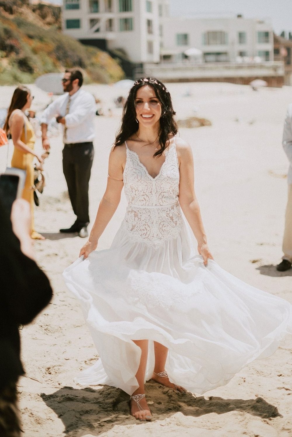
A rough test in daylight. Stand at a window in the morning without make-up. Look at the veins on the inside of your wrist: blue or purple suggests cool, green suggests warm, a mix suggests neutral. Then hold a piece of plain white paper against your face. If your skin looks yellow or sallow against it, a stark white will do the same and a warmer shade will suit you. If your skin looks pink or rosy and healthy, cool whites work.
Broadly: warm undertones (golden, olive, peach) suit ivory, champagne and warmer natural whites; stark white can make them look yellow. Cool undertones (pink, blue, rosy) suit natural white, stark white and blush; a heavy champagne can look muddy. Neutral undertones suit most of the range and should choose on fabric and mood instead.
The paper test is rough. The proper test is a swatch against your skin, covered at the end.
How does fabric change the colour of a dress?
The same ivory looks lighter in satin, softer in crepe, fainter in tulle and, in lace, takes its colour from the lining. Colour is a surface, and the surface decides how much light comes back.
Satin and mikado are smooth and reflect light. They make any colour look lighter and cooler on the highlights and darker in the folds. An ivory satin can read as white in the sun and as cream in shadow, in the same afternoon.
Crepe is matt and absorbs light. The same ivory looks softer, more even and slightly deeper.
Tulle is mostly air. Its colour is faint on its own and builds with the layers, and it takes on the colour of whatever is beneath it. Five layers of ivory tulle over a white lining look different from three layers over a blush one.
Lace is the complicated case. The lace itself has a colour, and so does the lining, and the lining shows through the net. An ivory lace over a white lining looks white with cream detail; the same lace over a nude lining looks warm and shows the pattern more sharply; over a blush lining it looks pink from a distance. When you compare two lace dresses, you are comparing two linings as much as two laces. The lace types guide explains why the density of the lace changes how much lining you see.
Ask what lining colours are available. Changing the lining is often the simplest way to shift the colour of a whole dress.
Photography and venue lighting
The colour that lasts is the one in the photographs, so think about the light you will be married in.
Daylight outdoors is cool and even. It flatters natural white and ivory and can make stark white glare.
Candlelight, tungsten and warm indoor lighting add yellow to everything. Stark white becomes ivory; ivory becomes cream; champagne becomes gold. In a candlelit church or a warm reception room, a slightly cooler dress than you would otherwise choose photographs the way ivory looks in daylight.
Flash and cool LED do the reverse and can make blush look grey and champagne look flat.
The white balance problem. Photographers correct colour toward a neutral, and the dress is often the reference. If the dress is ivory and the photographer balances it to white, your skin and the flowers will shift cool. Tell your photographer the dress colour in advance and show them the swatch.
Matching the veil
A veil need not match the dress exactly, but it must be chosen against it, because tulle behaves differently from the dress fabric.
An ivory veil against an ivory satin dress can look either identical or two shades apart, depending on the tulle. A veil a touch lighter than the dress usually looks right, because tulle is sheer and the colour reads weaker; a veil a touch darker almost always looks wrong. Order the veil from the same maker as the dress where you can, or bring the swatch when you buy it. The veil lengths and accessories guide covers the rest of that decision.
How do you compare colour swatches properly?
- Ask for a swatch of each colour you are considering, in the fabric of the dress, with the lining attached if there is one.
- Compare them at a north-facing window in the middle of the day, out of direct sun.
- Hold each against your collarbone, not next to each other on a table.
- Repeat under warm indoor light in the evening, or at the venue if you can get there, and photograph each swatch against your skin in both lights with the same camera.
- Decide with a day between looking and ordering. Every swatch looks the same after twenty minutes.
- Keep the swatch. You will need it for the veil, the shoes, the flowers and the lining of the wrap. Our guide to questions before buying puts it on the list for the same reason.
Do all of that and the label on the dress stops mattering. You will know what colour it is, and more usefully, what colour it is on you.
Colour and fabric decide each other, so the fabrics guide is the natural companion to this one. For the accessory most affected by the choice, see the veil lengths and accessories guide.